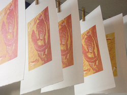
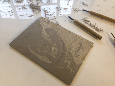
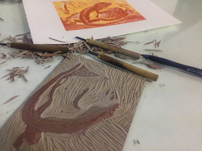
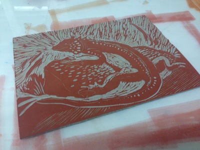
 Wanting to try a new technique that was more experimental and a little less precise than etching, I recently took a linocut course at the Art Academy. Using Japanese wood tools, we carved out blocks of lino before inking up and running through a press. And now I've finally found time to put them online. Click here to find out about the process and see the results.
0 Comments
Lucky enough to find myself in Lisbon for a couple of days, I escaped over lunchtime with an enthusiastic colleague to visit the Calouste Gulbenkian Museum - an astounding collection of European, Middle Eastern and Asian art.
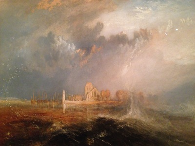
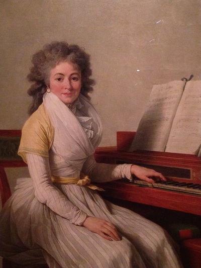
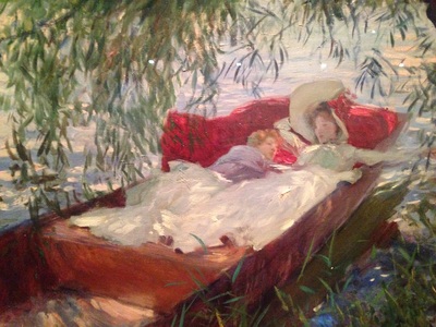
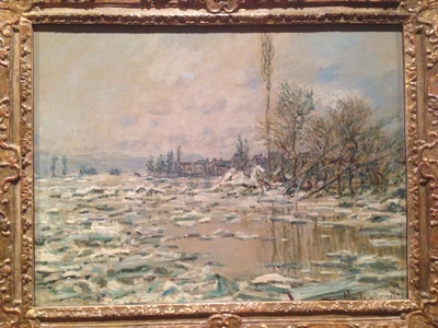
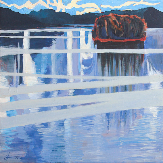
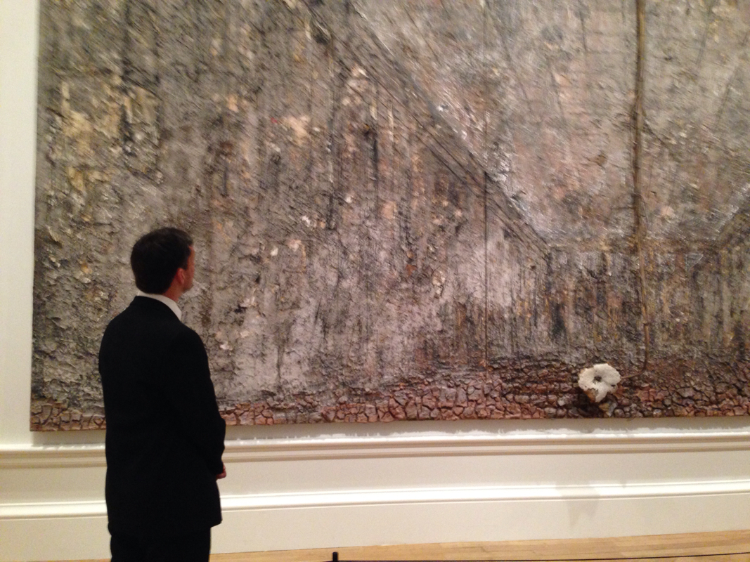
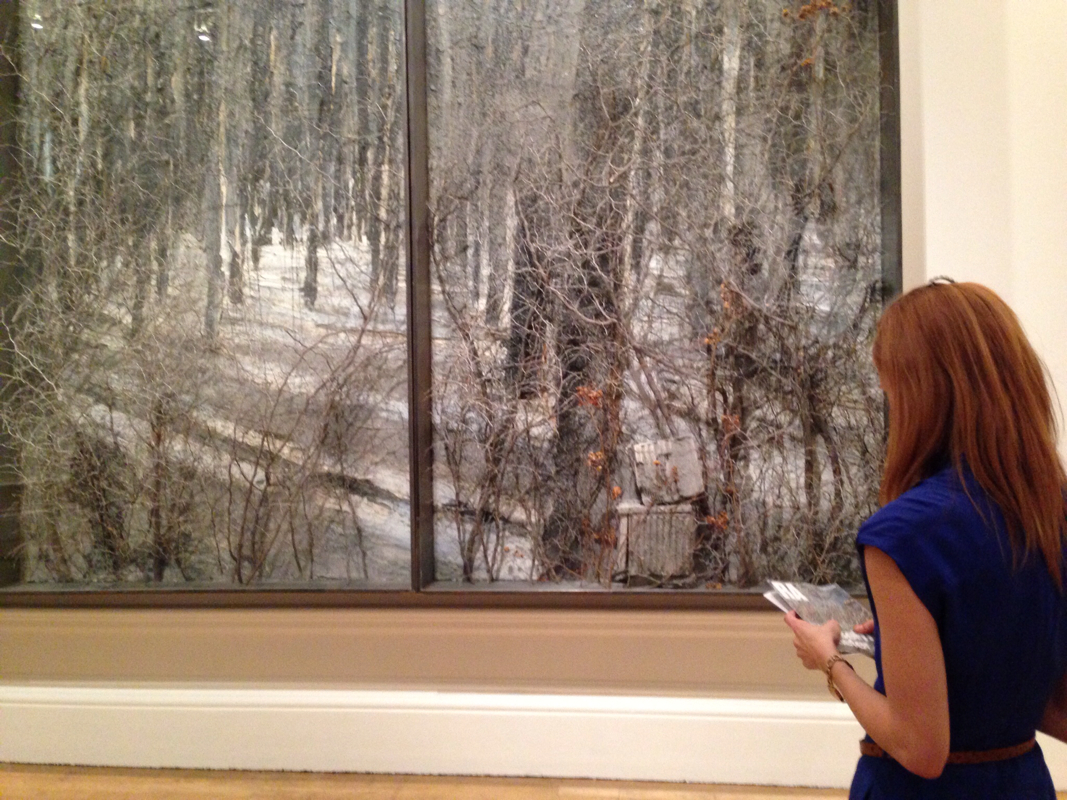
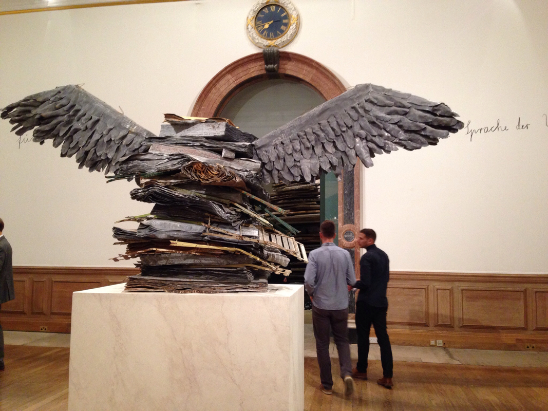
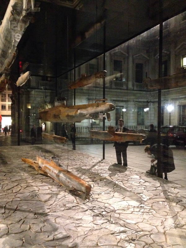
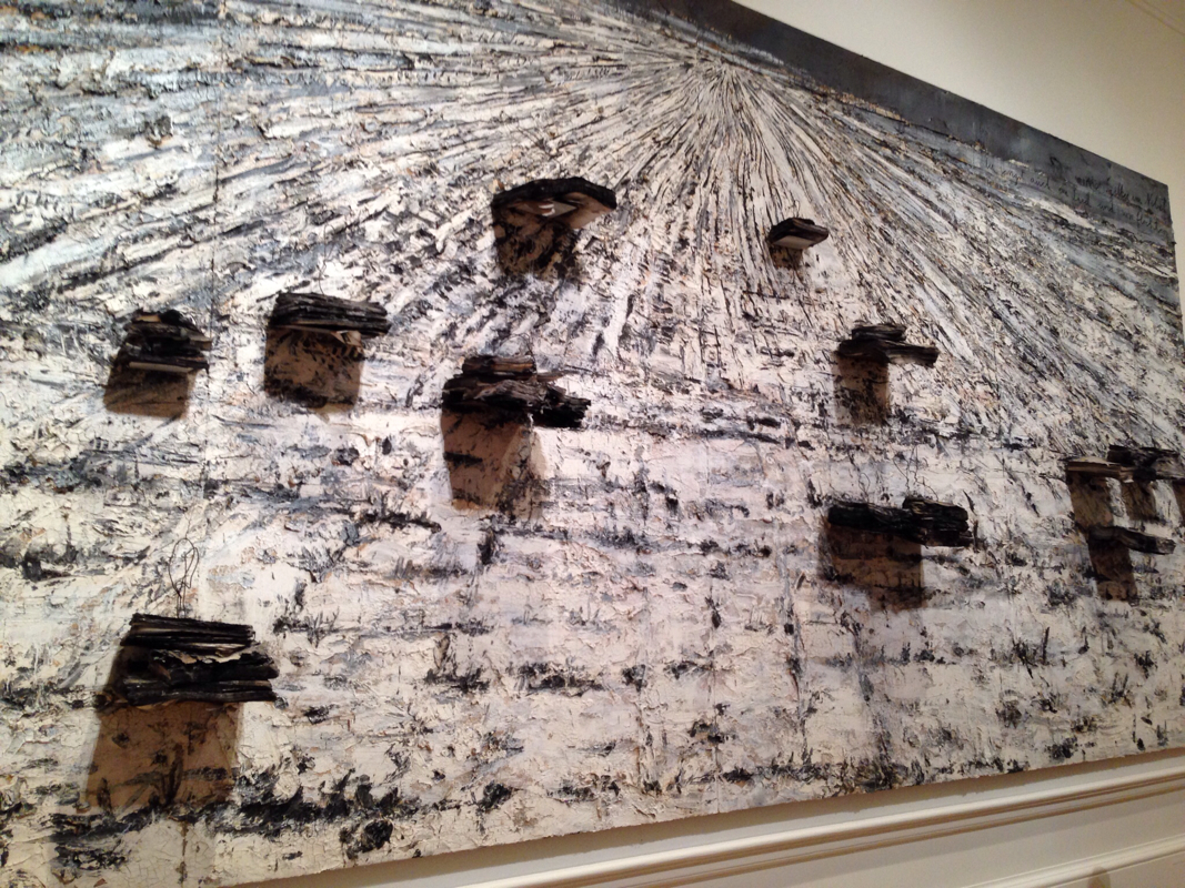
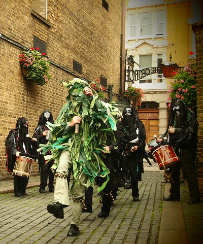
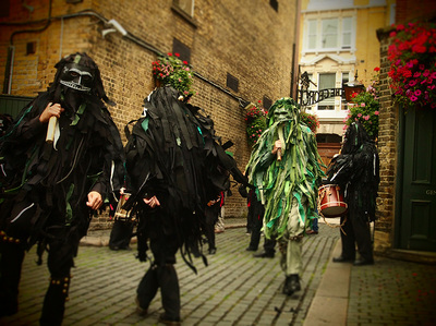
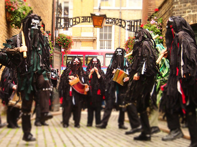
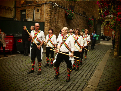
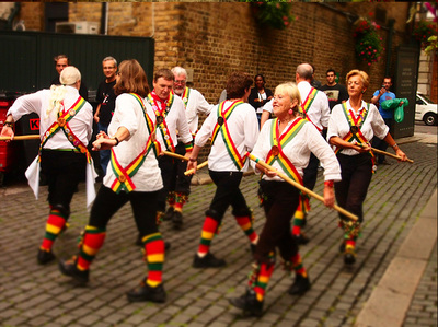
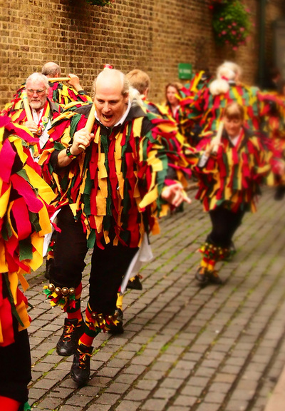
The corridors were silent and we wondered through the rooms of Egyptian sculptures, Roman coins, persian rugs, of chinese vases and Japanese laquer boxes, of paintings by Monet, Seurat, Cassat, Turner, and more, skipping delighted from one object to the next. The collection is exquisite and perfectly sized so that you're not overwhelmed by the display. The gardens are also lovely, and I went back on Saturday to eat in the sunshine and listen to the autumn birds. A treasure trove not to miss if you're ever in Portugal. It's one thing to fall in love with a picture in the national gallery - it's another to be able to afford one. Lacking the readily available millions, I decided to paint myself a reproduction. Not picture-perfect as we had to do so many years ago at university, more just my interpretation of Askeli Gallen-Kallela's Lake Kietele. One of the perks of my job is an occasional fancy after-work event that I am invited to. This time it was the opening night of the Anselm Kiefer exhibition at the Royal Academy. I wasn't that familiar with his work, and so went in with an open mind - found it quite astonishing, the sheer number of large scale pieces on display; the largest and most heavy sculpture ever shown in third space. The subject matter was similarly large and heavy - born in the ashes of 1945 Germany, the artist seems to have dedicated his entire body of work to ensuring the atrocities that took place are forgotton by none. A room full of pictures juxtaposing the nazi salute against Greek figures of heroism, the eagle wings lifting from a pile of smouldering books, a serpent slithering out from the rubble. Rubble is in fact a good word to describe the emotive range of many paintings, as he uses anything from lead, to diamonds to straw and acrylic to give depth and texture to his work, layering them onto a canvas in a sort of reverse-archaeology. The closer you stand, it's as if a cracked muddy river bed has been plastered onto the wall, and yet as you step further back a stunningly detailed forest will emerge, or a looming empty perspective of national socialist architecture. fascinating. Morris dancing - something I'd only read about in books before I moved to the UK. I met one of the dancers through an art class, and so went along to watch his team, the Wild Hunt (www.wildhunt.org.uk) dancing in the George Inn, Southwark.
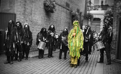
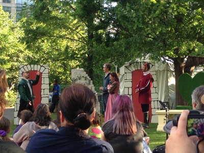
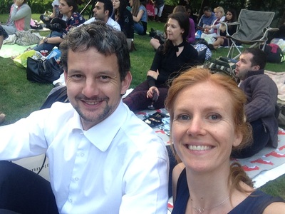
The dancers were dressed in black rags with dark masks on, with one only dressed in green, representing summer. In all, they did 4 dances, complete with holly-wood sticks and bells on their legs. My favourite was a 3 minute dance describing both the beginning and ending of the world, to the music of flutes, drums and accordions. It was the last day the green man could dance before winter. Astonishingly beautiful and artfully pagan. What fun to watch the heart of the countryside dancing on the cobbled streets of London. I love living up in the north of the world - almost as much as I loved living down in the south of the world. In fact anywhere that the light streams in at an angle which gives you hours of daylight beyond your allotted 12hrs in Hong Kong is pretty special. This evening we went out to the park to watch Much Ado About Nothing - the second time I've seen it performed this summer, but still just as wonderful.
http://www.canarywharf.com/visitus/arts--events1/events/ Spotted on the London underground
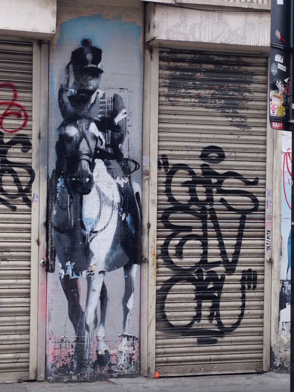
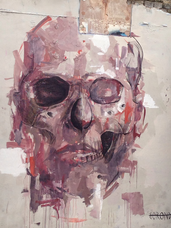
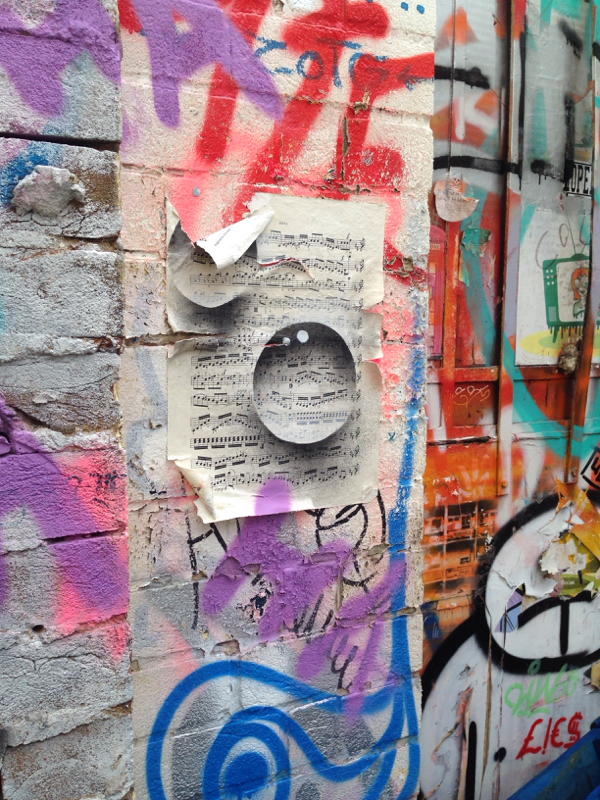
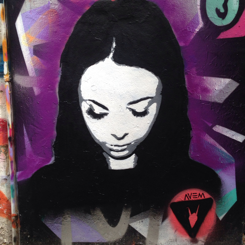
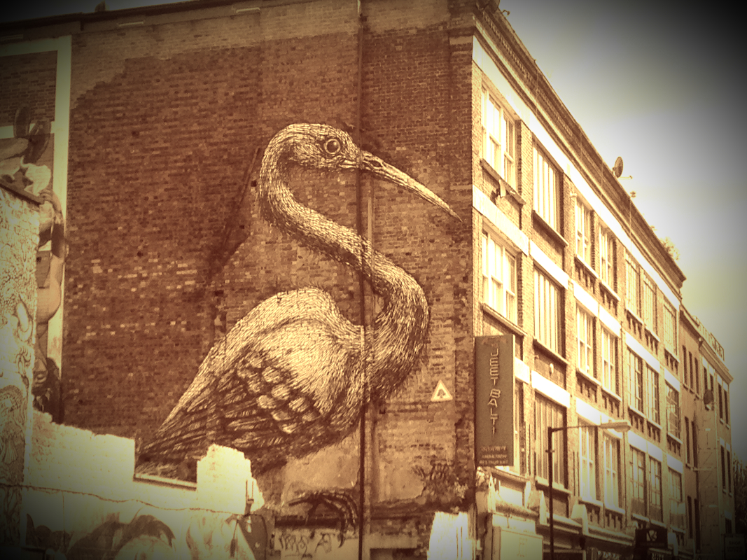
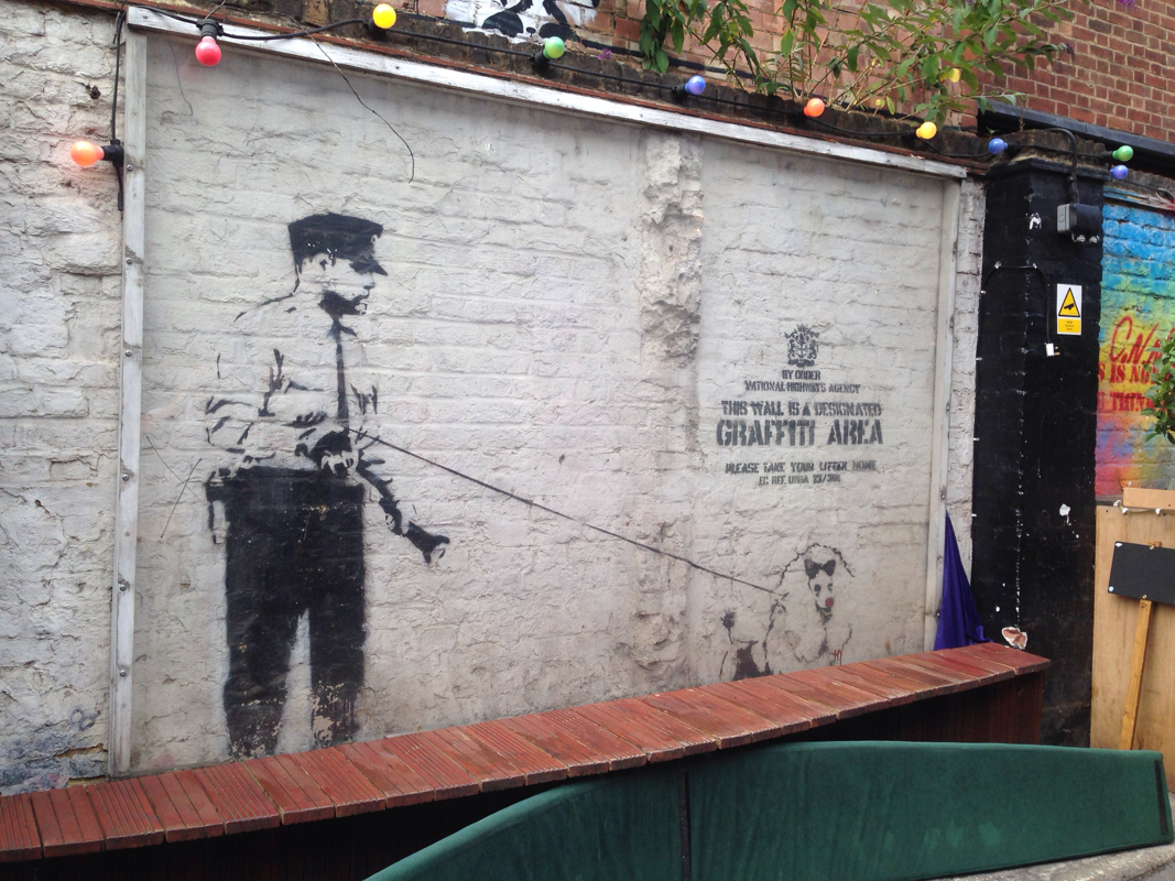
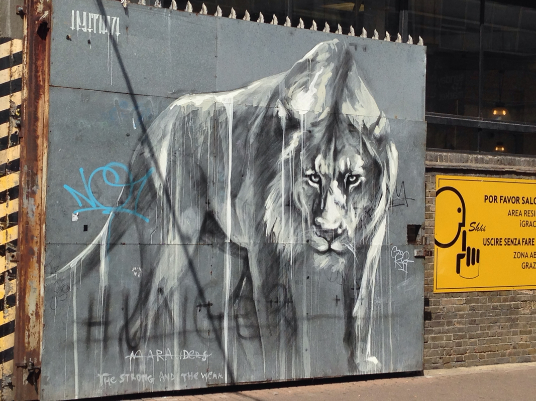
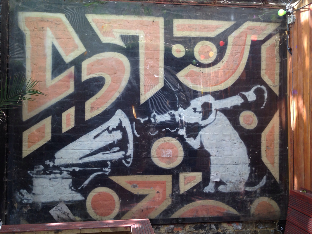
Mysteries At night, I do not know who I am when I dream, when I am sleeping. Awakened, I hold my breath and listen: a thumbnail scratches the other side of the wall. At midday, I enter a sunlit room to observe the lamplight on for no reason. I should know by now that few octaves can be heard, that a vision dies from being too long stared at; that the whole of recorded history even is but a little gossip in a great silence; that a magnesium flash cannot illumine, for one single moment, the invisible. I do not complain. I start with the visible and am startled by the visible. ~ Dannie Abse Never content with a quiet weekend at home, we ventured out into the streets of London to take in the profusion of street art, slapped haphazardly across the walls of shoreditch.
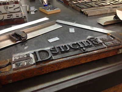
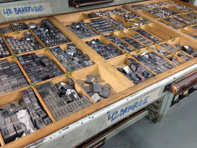
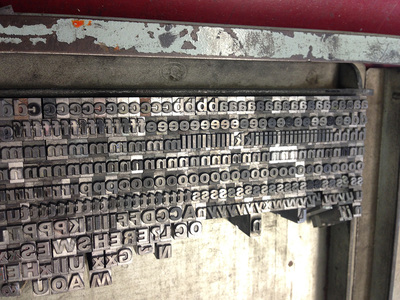
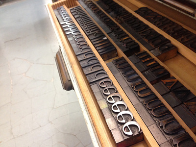
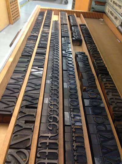
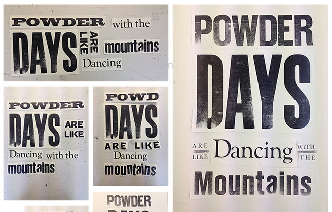
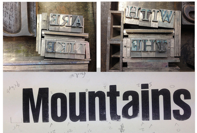
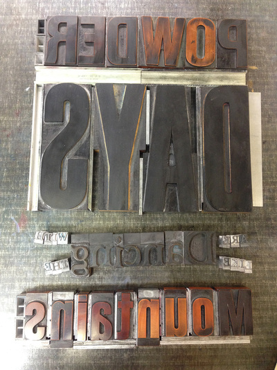
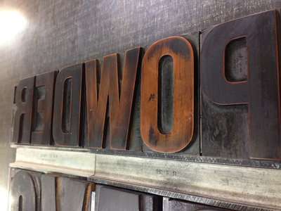
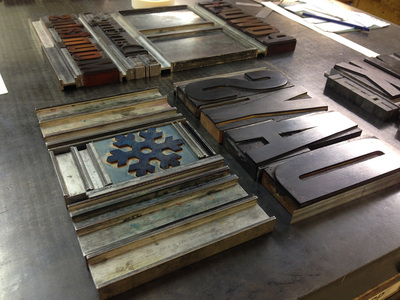
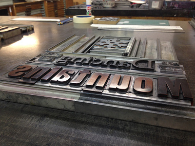
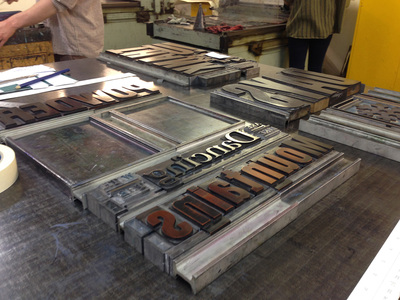
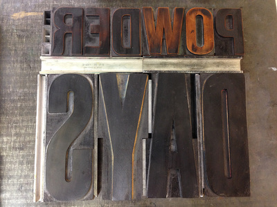
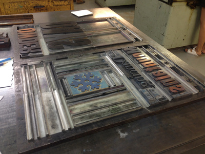
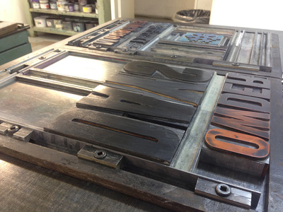
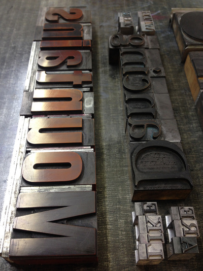
Dave, our guide, walked and talked us through the 'outdoor gallery' of brick lane, stopping to point out the stickers on lamposts, tiny sculptures hiding away on signposts and the myriad of paintings which he attributed to various artists. We learned of the history of the area, each wave of immigration bringing another flavour to the city and leafed through the layers of art left by street artists on the colourful walls. Superb Sunday morning stroll with a twist - walking through London will never be the same again. Check it out for yourselves: www.shoreditchstreetarttours.co.uk 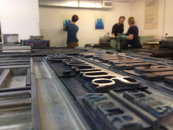 Last week I took a 3-day Letterpress workshop at the London College of Communication (previously the London College of Printing). The tutor, Christian, gave us a great overview of typesetting and printing - who knew the process was so labour-intensive! It gave me a whole new appreciation of the pre-digital world, as well as bringing me back to the roots of graphic design. Scroll down for an overview of the process... TYPESETTING First you decide on the words you want to print. I went with 'Powder days are like dancing with mountains' to commemorate my awesome year off skiing the world. Then you need to go and put these words together. The workshop has drawers and drawers full of moveable type, all the tiny letters in their individual sections, with rows of Garamond, Baskerville, Courrier, 8pt, 12pt, 14pt etc all cast from lead, or carved from wood or plastic. PROOFING Once you have all the letters you want, you sandwich them together on a galley tray and run them through the proofing press (the galley press). This is a small easy-to-use press designed to check you have all the letters in the right order. Since you're laying the letters upside-down and back to front, it's no small feat just to print them in the right order! After this I cut out all my printed words and tried out a few ways to arrange them on a page. SPACING One of the things that surprises me most was having to manually add the spaces in for kerning. The spacers were little lead strips of different widths and lengths which you add between the letters. Everything is measured in points and picas (12 pts to 1 pica). Even though I've used these measurements on a computer for years, it was amazing to see them as physical representations of space. Just look at how many tiny metal plates are surrounding the words in the pictures below - a nightmare to fix if they get all jumbled up!! MAKING FRAMES Once you have all your type together, it's time to build a frame. Again, all the white spaces have to be filled with spacers, until all your text is perfectly flush inside a metal jig. You should be able to lift the jig off the floor without any metal falling out - quite a feat when using such intricately small pieces. I felt it was like doing an enormous jigsaw puzzle where the final picture exists only in your head. 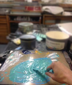 MIXING COLOURS One of the hardest decisions was around which colours to use. There's no quick trial and error like you get on a computer - you had to make a colour decision and stick by your guns. Cleaning the rollers of colour takes about 20 minutes, so if you make a mistake, it's a lot of effort to fix it! I took a deep breath and went for silver and sea green - keeping cold colours for the snow and mountains. TO THE PRESS! The last stage of the process is clamping down the frames to the bed of the press so they won't move about and ruin your registration. Once tight, you slap some colour on the rollers, run the press and put one page through it to see what it looks like. Then it's a matter of tapping letters down, or raising them up with bits of paper underneath so they're all exactly the same height. This is a lengthy process involving lots of un-clamping and re-clamping of your work on the press bed, making minute adjustments to correct the registration and print quality. It takes FOREVER! I can't believe people have done this for 400 years and not a computer in sight...! ET VOILA! 3 days of hard work later, and my final poster was on the racks and drying. I have about 20 copies, so message me if you'd like to buy one ;) I thought they came out rather well, with the toothed paper giving a powdery effect to the word 'powder' and the mask that I placed over the word 'mountains' giving the effect of a mountain range at the bottom. I deliberately chose a serifed typeface for the word 'dancing' to give it some freedom and movement. I even got the de-boss effect I was looking for when I first got to the course! |
AuthorWith a career ranging from design and publishing to finance, marketing, and snowboard instructing, Cara has a wide range of professional skills and is always looking for new things to inspire her. Archives
November 2014
Categories |

 RSS Feed
